I feel like the second one is the stronger of the two as far as layout and movement, less directing, more natural. I also like the break up of the composition better. There's some value issues which I need to work out but overall I am feeling really confident in my direction!
Tuesday, April 28, 2015
Poster Direction
I absolutely loved all the feedback I got on my posters! Very helpful! I didn't realize we do not need a title so I decided to ditch that since I felt it was hindering my poster.
Friday, April 24, 2015
Steps 1 & 2
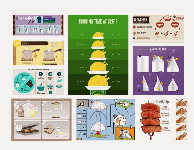
For this project I decided to create a How To poster on how to pop popcorn with an air popper. First I researched currently existing How To posters. What I found was that most of them include words for instructions. I decided to include them in my research anyway because I could apply the styles and typography choices to my sketching and brainstorming.
After researching, I experimented with different angles and ways to approach the steps. I included more possible steps so I had options on which ones to end up with. With those photographs I sketched out thumbnail ideas. I explored different text placements as well as formations for the steps.
After sketching I created a couple of rough digital comps. I really liked a style I sketched out so I played with color and layout within that style for these two digitals. I feel like the style well captures the playfulness of popcorn and keeps it in a more mature light like using an air popper does.
Subscribe to:
Posts (Atom)


